This week I was tasked to adapt my logotype in a number of ways. The initial task was to change the text from “Olly Edson” and produce a graphic which best suited my influences and topics I am exploring with my project. The second task was to change the colour scheme of the logo from the black and white of illustrator, again to one which best suited my influences.
After fully deciding on what path my design would be following in Week two’s task (Logotype). I invested some of my time researching other ‘on trend’ food businesses and further researching how they utilise social media to project their business. By doing so I could relate information to my own design. I discovered that food businesses typically try to relate their marketing and colour scheme to that of their ‘main’ product. For example, a business primarily producing vegetarian or vegan foods follow a more “natural” colour scheme which often uses green. On the other hand a steakhouse would use brown colour scheme. Doner Summer uses hot pink as the majority of their products use their signature ‘pink mayo’.
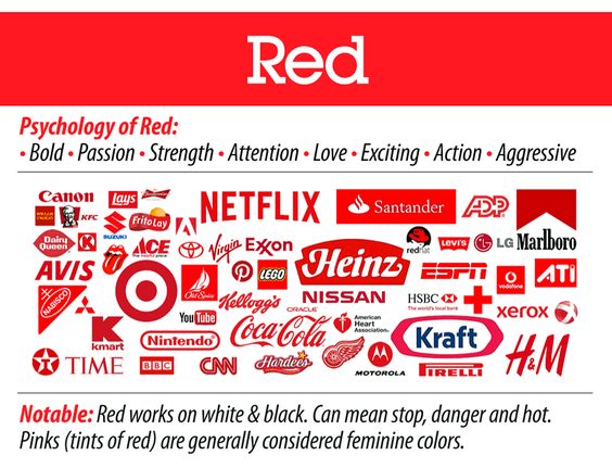
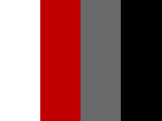
I chose to follow a bright red and white colour scheme as it has many connotations to food, primarily with meat but also can be associated with vegetables. It is also widely associated and matched with black, grey and sometimes blue which gives me creative freedom when designing my portfolio.
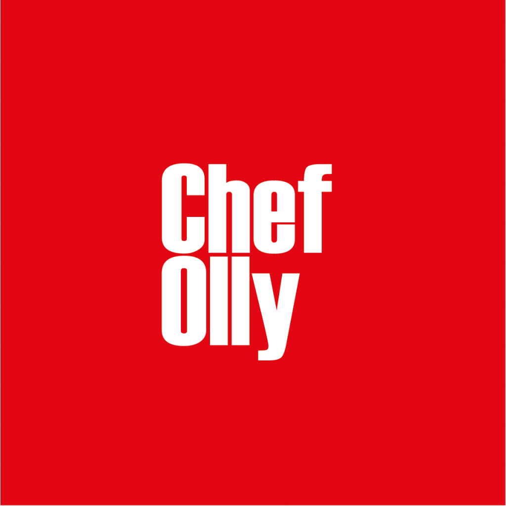
To create my redesigned logotype, I created a red background and changed the text to say ‘Chef Olly’, and substituted black text to white to create a vibrant and in-your-face new graphic.
References:
The Logo Factory (n.d). Available online: www.thelogofactory.com/choosing-great-logo-colours-help-brand-selection/