For my poster, I will be following the theme of food. I had two distinctive ideas for my final design and in this blog post I will explain both designs and which one I have chosen to take forward for the final project.
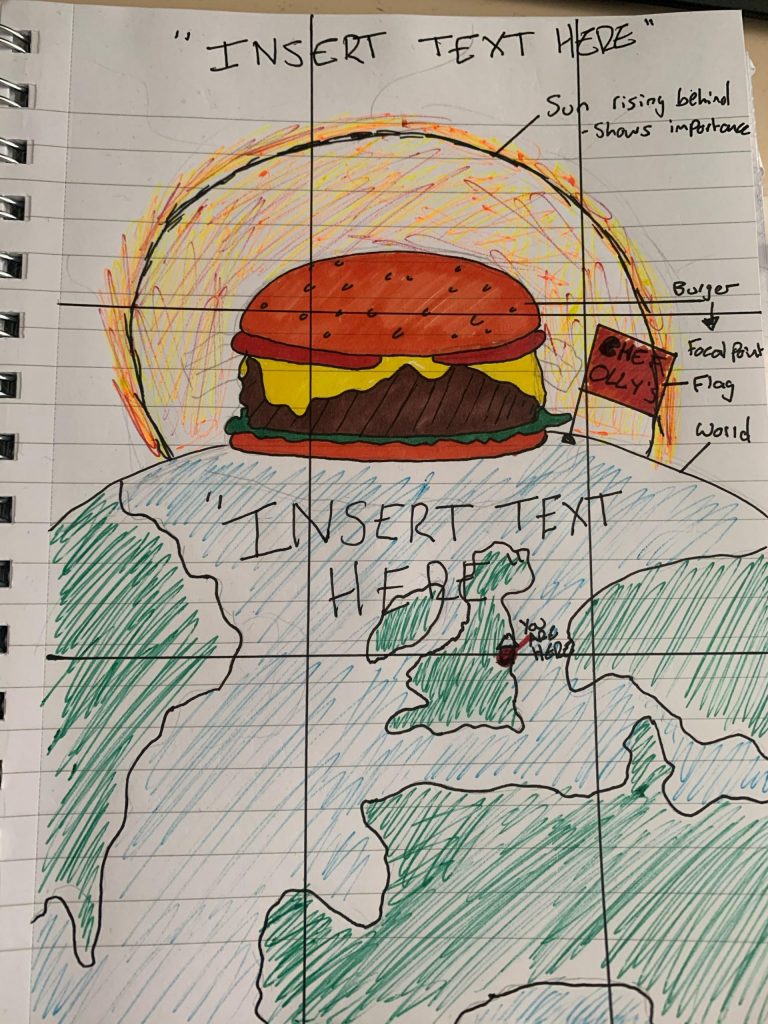
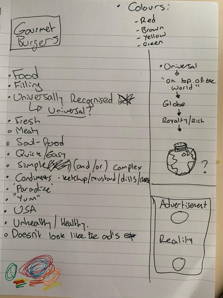
My first idea was to take a ‘safe-route’ in this project and design a poster based around gourmet burgers as it is an area of food I am well-versed in. However, upon thinking of a design and creating it, I felt that it was not as conceptually complex as I initially intended, and I knew I could do better. The idea was based upon having a burger that was so good it was “out of this world” almost resembling that of a comet with the sun portraying the light emitting from it. However, I felt that that was just about how far the conceptual idea went. I followed the ‘rule-of-thirds’ and important advertising criteria (stated last week), but was still disappointed and decided to change my poster to be based upon Steaks.
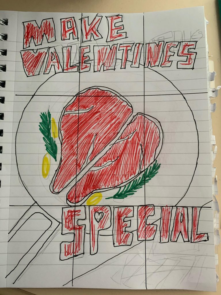
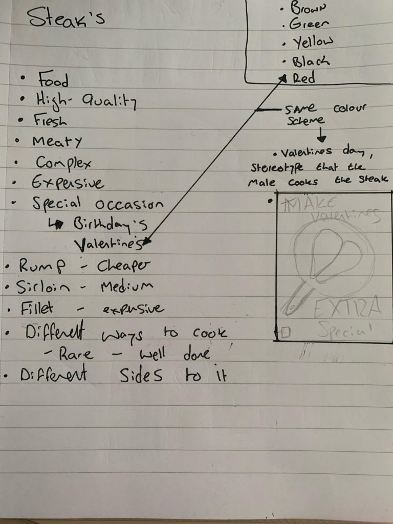
My second and final idea, focuses on steaks and the romanticism that surrounds the food – especially when valentine’s day swings around, and the stereotype that the “man” must cook his partner a steak. This is highlighted by the choice of wording, implying that if they want to make “valentine’s special” they must purchase the steaks in the poster. I feel that this is also more conceptual as the image or vector I will be using will be of two sirloin steaks in a pan form the shape of a heart which is a semiotic of valentine’s day and the emotion of love and affection. The use of the colour red also reinforces these emotions and signals. I feel that this draft eclipses the previous idea as the rule-of-thirds is far better utilised, and the conceptual idea is far more deeper. Also, who doesn’t like a good steak?