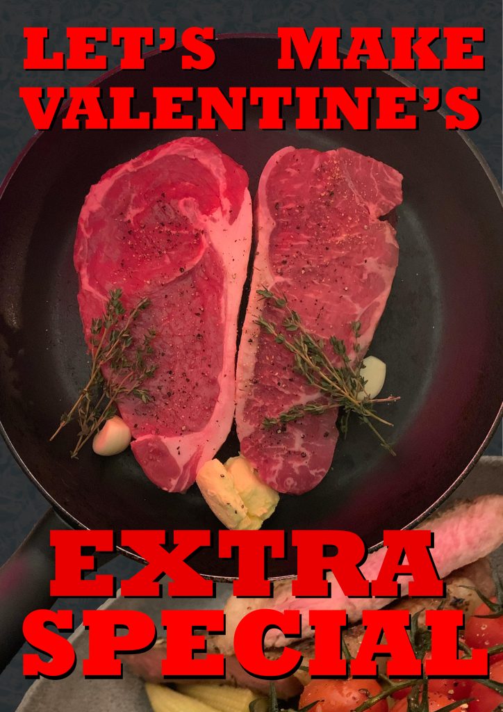
The aim for this post was to use original photographs to aid my poster design. I attempted to utilise a lot of photographical techniques in order to produce a mock up for my poster, this included lighting, framing and contrast.

To begin I referred to my notes and mapped out how I wanted it to be framed, I gathered all the items needed to be in shot and framed them as intended. This was fairly difficult, especially when dealing with delicate components such as the butter. However, I feel that it very close to that of my vector. I followed the rule-of-thirds to demonstrate to the viewer that the important assets in the poster is the steak as it crosses all of the metaphorical lines, thus making it the focal point. The conceptual design of my poster is to make the steaks resemble that of a heart to convey the idea of love during the valentines period.
I took photos of the pan next to candlelight and a red light using a torch in the background to create ambience and to follow the conventions that valentine’s day brings to mind. I also added a red-pink tone whilst editing the photo in Photoshop using the ‘gradient fill’ tool and adjusting the opacity, to further the perceived emotions. To create the marble-esque background I found a tutorial online to create a smoky background. This created the base effect, I then used the smudge tool to blend it further, I then put a grey layer over that in post and changed its opacity.
To follow conventions of other advertisements in this field, I then took an image of the meal I cooked using the steaks in the original image. The steak is cooked medium-rare as that is the most common way a steak is consumed.