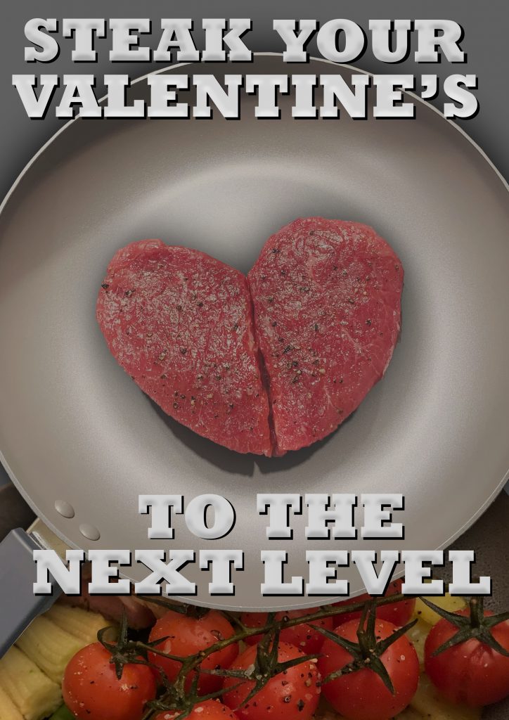
This is my first draft and penultimate post before submitting my final poster design. As each week has passed, I have incrementally added to my initial design and poster idea, whether this be using a vector in Illustrator or by adding photos and manipulating these in Photoshop.


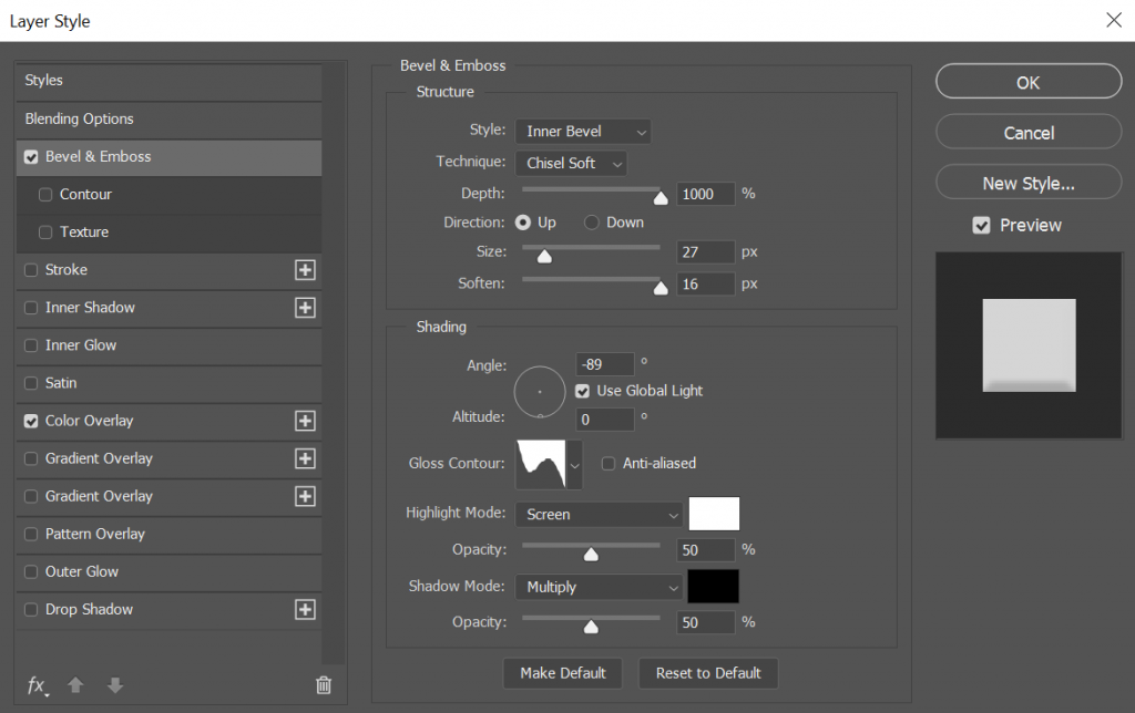
In this instalment of improvement, I have changed a number of things. The first and most obvious is the text I have used. Rather than purely playing upon the emotions and connotations of Valentine’s day as previously stated, I have changed the tagline to “Steak your valentine’s to the next level” in which the word ‘take’ is swapped with ‘steak’. This is a play on words and provides a light-heartedness on the advertisement, which can accommodate for a broader audience. Due to this, I chose to change the colour of the text from red to white as it is a pure colour, yet still has connotations of love. The colour red is still apparent, however has a much more subtle tone. An embossing effect is also used to generate a 3D effect, which allows the text to stand out despite being in a less harsh colour.
I have also changed the main body image to one which better suits my brief. It is a higher quality image and more in focus. It is also features two more expensive steaks in a new pan and they are carved into more of a heart shape. This shows to the potential audience that what they are buying is of a higher quality and also reinforces the ideology of the romanticism and the best option for Valentine’s day. I decided to remove the crushed garlic, butter and thyme as I felt it left the image looking cluttered. To finalise the design, I plan to add a logo to the bottom of the image to add a sense of it being a professional advertisement as well as potentially adding more text to the bottom such as terms and conditions to further this.