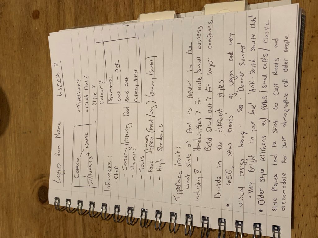
For this weeks assignment, I was tasked to construct a logotype for myself using my name as the text and utilising my main ‘influences’ as a source. Initially, I went to my notepad to gather as much information as I could in note form to transfer into an artboard and eventually create my logo on Illustrator, as well as thinking ahead and starting to understand come colour concepts for week three’s task.
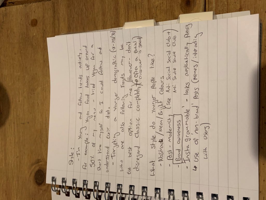
Upon researching, I found that two styles of logo were the most popular for restaurants. These were a classic style of font for the smaller ‘gastro’ style pubs who use an old fashioned, almost western font which also typically follow very a beige colour scheme. Whereas newer ‘trendy’ food businesses tend to use bold and ‘in your face’ fonts alongside bright contrasting colours, for example,
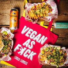
Döner Summer – a vegan brand use hot-pink and is a colour now synonymous for their brand. Newer businesses also have the added pressure of surviving in a hugely diverse market, especially on social media. Therefore, having a recognisable brand is paramount. I intend to follow the contemporary route for the rest of this assignment as I feel that being a visual design course, I can utilise and take inspiration from new and upcoming ideas within the industry and implement them into my designs.
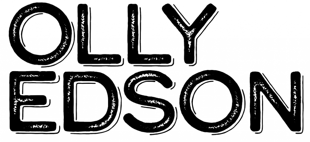
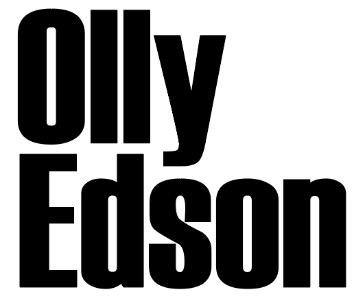
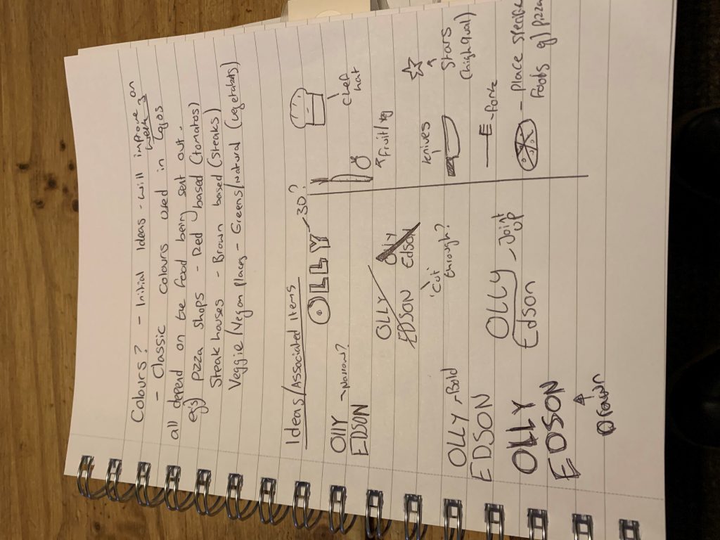
After creating two logos following both styles, I came to the conclusion that the best logo to suit my influences would be to follow a modern style (See left). This meant that I would be using bold text and eventually mounting this on a brightly coloured background.
I decided to choose the modern style logo as it was derived from what my primary research discovered. It is in a bold font, in one solid colour which in turn can be repurposed in many ways in order to improve brand awareness as it is more “Instagrammable“.